Mobile-first design
We design for the phone screen first, then scale up for desktop. The top of every key page shows what you do, the area you serve, and a call or booking button.
 TechneonSolution home
Many customers find a local business on their phone, often in the middle of something else. In the first few seconds they decide whether to call, book, or go back to the search results. We design Fresno websites around that moment: quick to load, clear about what you do, and one tap away from a call.
Free consultation: we'll show you where you're losing calls and what we'd fix first.
Last updated
A trustworthy mobile site loads quickly, shows what you do and where you work at the top of the screen, and puts a tap-to-call or booking button within easy reach. Real photos of your work or team, recent reviews, and clear hours build confidence fast. Text should be readable without zooming, and forms should be short. If visitors have to pinch, wait, or hunt for your number, many leave.
We design for the phone screen first, then scale up for desktop. The top of every key page shows what you do, the area you serve, and a call or booking button.
We compress images, remove heavy scripts, and simplify pages so they load quickly on mobile data. A faster site keeps more visitors long enough to call.
Real photos of your work, recent reviews, your hours, and a short list of services appear early on the page. Visitors can judge you in seconds without scrolling through filler.
5 steps from the first conversation to results.
We open your current site on a phone and note what slows down or confuses a visitor.
For each key page, we decide what a visitor sees before scrolling and what action we want them to take.
We build the phone layout first, then adapt it for larger screens.
We test loading speed, buttons, forms, and tap-to-call on different devices before launch.
After launch we track calls, button taps, and form submissions so you can see what the new site brings in.
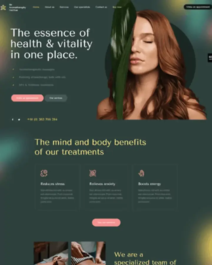
Soothing spa website design with earthy tones, natural imagery, and treatment focus.
(see it in our work)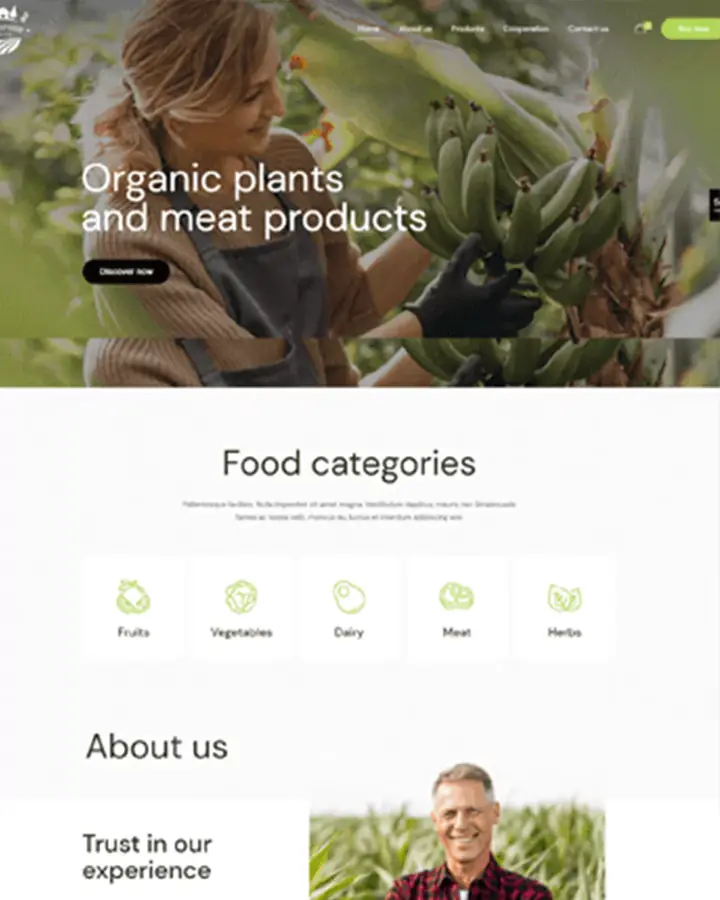
Organic food website design, natural imagery, green accents, product categories, and company information.
(see it in our work)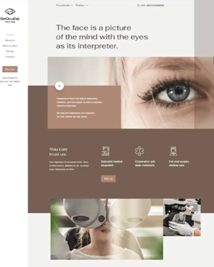
Modern ophthalmology website design with neutral tones, eye-focused imagery, and treatment details.
(see it in our work)Open it on your phone using cellular data, not Wi-Fi. Check whether it loads quickly, whether you can read the text without zooming, whether the phone number is tappable, and whether forms are easy to fill in. Google's free PageSpeed Insights tool also gives a mobile report.
If the structure and content are sound, mobile fixes to layout, image sizes, and buttons may be enough. If the site runs on old code or a platform that resists changes, rebuilding is often quicker and easier to maintain. We'll tell you which after looking at it.
A basic business site usually takes three to four weeks, and a complex site takes two to three months. Mobile fixes to an existing site are often faster, depending on what we find when we look under the hood.
Page experience, including how a site works and loads on mobile, is one of the signals Google considers, though relevant content matters more. The bigger effect is on visitors: a slow page loses people before they ever call.
Whether you need a new design or fixes to your current site, the number of pages, features like booking or online ordering, whether photos and content need creating, and whether you want ongoing care after launch. We scope it after a free consultation.
Don't see your question?
Send us your website. We'll look at it on a phone and show you what's costing you calls and what we'd fix first.